For this task, I had to design the box art for my game. I have drawn a rough first sketch of what I would like the cover to look like below.


I have the basic frame on the front cover as well. The Games for Windows Live, whilst outdated, matches the graphics and art style of the game, showing that the game is old. I have a Mature rating on the game as it does contain strong language and excessive language, right from the first level. The publisher I have chosen is EA, simply because their logo is easy to draw. I created a logo for my indie studio "BlitzHammer", which I think will work well with my magazine advertisement, because I could do a small interview in that, discussing what it is like being an Indie Developer.
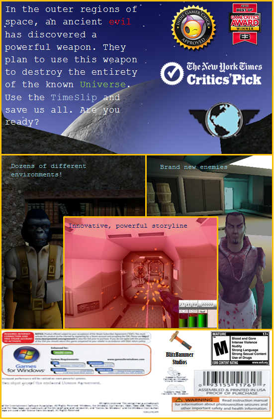
For the back cover, I have a small blurb, providing an brief outline and introduction to the game. The background to this bit will be a good background from within the game, I already have a shot in mind for this as well. The second section is then split up into 3 main chunks, seperated by diagonal lines. On the left hand side, will be a screenshot of the Simian in our game, as he serves a special role within the game. The middle, and biggest section will be a screenshot of some combat within the game. This is the most important section of the middle because it will show the audience that the game is a FPS as well as advertising the action. It will also provide a brief in look into the HUD and interface of the game, as it will show the health and inventory bars.
The right section will be a picture of the boss that appears within the first level. This is so the players in game will see a face they recognise and will know that he is an enemy whilst playing the game. The bottom section will display the standard technical information, such as the age rating, developer/publisher logos and possibly system requirements. I may include reviews or awards in this section should they fit.


Bigger version can be seen here
I have created my box art, following the same design as my drawn sketches. There were a few adjustments made. On the front cover, the planet in the bottom left hand side was removed due to sizing issues. In order to make the text large enough to be read, it had to be removed. In order to effectively convey that the game is a Sci-Fi game, I changed the background to be more obvious that it has a space theme. I then used a font "SimSum" which was the closest to a "Sci Fi" font as I could find on Microsoft Word. Other than that, it looks fairly similar to the sketch. I found images for the EA and ESRB rating and then created my own design for "BlitzHammer Studios". The GFWL banner came from a template.For the back, it looks quite different to the sketch. The moon is in the middle, as that was the best picture I could take in game. I then changed the blurb around slightly, to make the game seem more appealing. After that the tri-picture setup was changed due to technical issues. Instead of having 3 sections separated by diagonal lines, I chose to link two images together, then overlay a third. I then separated by gold boxes, with thick outlines and no fill. This gives the middle image a more 3d effect. The images are the same as the sketch, with Gibson on the left, the first level boss on the right and some combat in the middle. This showcases some of the major characters in the game, as well as showing the audience that the game is a first person action game. The standard requirements stuff is at the bottom along with the developer logo and the ESRB rating again. There wasn't space for the publisher logo (EA) whilst using the specific ESRB rating I used, but after some research, it turns out that the ESRB rating has to give a brief summary as to why the product has been given the rating it has "Strong Language etc", and as such, I had to leave it out.
Version 2.0 of my box art is below. After gathering audience feedback I made changes according to features that they wished to be changed/included.

Bigger version can viewed here
On the surface, it doesn't look like much has changed, but one of the most requested featues from the audience feedback was a "Logo". The game did not have an independent logo that it could be identified by before. I have since created one specifically for the game. You can see it above the hour glass on the front page and below the awards on the back.
Another thing that needed to be changed was the fonts used. Although they were all different fonts, the feedback suggested that they all looked very similar. As such I have changed the fonts of a few sections, to make it more apparent that they are different sections.
I have also edited the blurb on the back of the game to be a different font as well as changing the colour of certain, important words. I then added a "feature list" as this was also requested, with one line on each picture in the montage section.
No comments:
Post a Comment