Friday, 27 March 2015

Magazine Covers


For this task, I had to create a magazine article to advertise my game. My planning and final version are below:


Click on the image to enlarge
This is my sketch of the front cover of my magazine. I will be using PCGamer as a base. The background will be a screenshot from within the game. In the top right will be the moon, and in the centre will be a medium shot of G1BS0N.
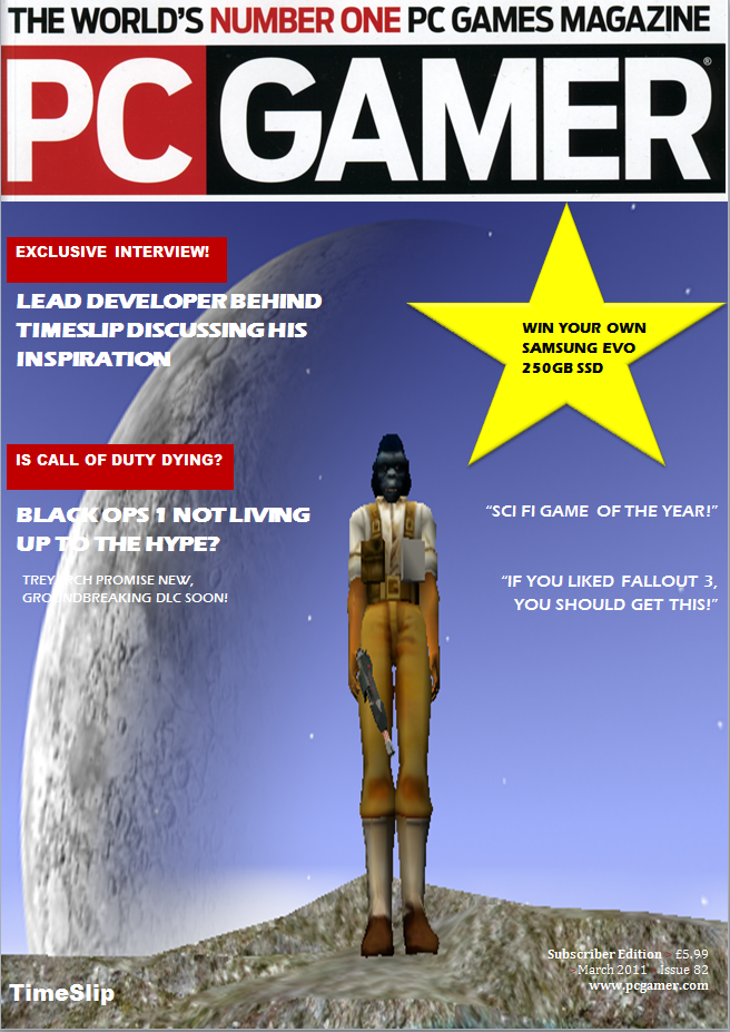
On the left hand side, it will advertise an exclusive interview with the developer, which I will conduct on the double page spread.
I have also included other news stories, as most of the covers I looked at in my research, featured more than one specific story on the main page.
On the right, I have a few unspecified quotes, making it obvious that the game is a Science Fiction game, as well as comparing it to Fallout 3. This will hopefully attract people who play Sci-Fi games and/or Fallout 3 and haven't yet heard of the game. It will also grab the attention of those who are fans of PC Gamer, and value the opinion of the magazine highly.
In the top right hand corner is advertising for an SSD. This will serve as the "free gift" incentive that PC Gamer seems to include in each edition of their magazine.
Click on the image to enlarge
This is my sketch of the double page spread. It is done on a landscape A4 page, so it isn't to the same scale as the spread will actually be.
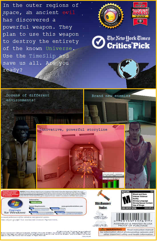
There will be 3 main columns to the spread, the left hand side will be a short description from the magazine itself, which will act as if they had a small demo of the game, and give their thoughts. The middle section will be screenshots from the game, one of an action scene, one of a close - up with G1BS0N and the last one being the box art from the previous ancillary task. The far right column, will be the interview with the lead developer. This interview will talk about how the game is structured around its intended audience, and specific beginner features have been included, such as the terminal at the beginning of the level.

Click on the image to enlarge
This is the finished version 1.0 of my front cover to my magazine. There were quite a lot of changes from the original plan. I found an image for the original PC Gamer banner, which does change quite a lot. The circle on the right, which contained the advertisement for the free SSD, has been replaced by a gold star. This is because I think it is more fitting to use a star here. The quotes have been slightly changed. It now explicitly compares TimeSlip to Fallout 3, to clear up any confusion.
The boxes containing "Exclusive Interview" and "Is Call of Duty Dying" have been changed to red, to fit in with the PC Gamer theme. The background image was not actually sourced from the game, as there was no part of the level which was open enough to get a full shot of the moon like I wanted. To get around this, I made a small level using a similar tileset, then moved a replica of G1BS0N into the level and took a picture that way.


Click on the image to enlarge


After conducting the a round of audience feedback, it was noted frequently that the cover of the magazine was not as effective at it's task as the rest of the products created for ancillary task 1 and 2. A few of the criticisms included "The star doesn't quite fit in with the rest of the page" and "The title is lost in the corner".
As such, I have made appropriate adjustments as you can see above. I have replaced the star with an actual image of the device that the audience could win, and changed the font and colour text slightly so that it stands out a little more from the rest of the page. I have also moved the title from the bottom left hand corner, to the top right and have massively increased the font size to make it more obvious, as well as colouring it in the typical Science Fiction colours. It should be noted however, that this goes against the typical PCGamer house style, as in the majority of the covers I looked at, the game's title was in the bottom left of the screen, as it was the image from the game that was used as the selling point of the cover, not the actual game itself.
Another adjustment made, is the addition of the circle in place of the title in the bottom left hand side. This now contains relevant PC articles which would be included later on in the issue if this was a real magazine. They are coloured bilaterally as to fit in with the house style as well as break up the colour so that it is more easily readable. The last major change was addition of small circles containing other popular games, The Elder Scrolls: Skyrim and Crysis 3, that were realised that year. These help break up the front cover and provide attention to other games, which a real life front cover would do. Another text box was added, providing an explanation of "Trailer Analysis" to the images.

Click on the image to enlarge


This is the finished version of my double page spread. Essentially it is the same as the sketch plan I did. A few additions were the rating on the bottom and the text box in the centre. These were implemented to break up the page a little, and provide a little variation. 
The text on the left hand side reads as follows:

"When I first heard that BlitzHammer studios, a relatively small Indie developer was planning to make a “noob friendly” AAA equivalent game, I was sceptical at best. But after the promotional material we have seen and the small first level, in house Alpha, we were lucky enough to play, I have got to say, I am blown away by the amount of potential I think this game has. The level looks amazing, lacking in graphical sense, I must admit, but the layout and design is superb. Playing through it, I could tell that on the difficulty it was on, a new player would have no trouble navigating through the level as easy as they do their own house. On top of that, the enemies AI seems to scale with the difficulty level, so at the easier ones it’s like shooting fish in a barrel, which is what a new player needs on the first level. Whilst at the harder difficulties, I almost felt that the enemies I was facing were real, competitive players. There is still a lot we have got to look forward to, and the Lead Developer has been teasing a new trailer for some time, and I can say with full honesty that I am exceptionally looking forward to that. I can’t wait to see the story of the game unfold, and see some of these other characters. We were teased with G1BS0N in the Alpha, who serves as a unusual “G-Man” type character throughout the game, helping or hindering the player depending on the choices they did OR didn’t make. For an independent company, this is stellar game making, and im not excited to see if they will win any awards at E3, but how many they win."


The text on the right hand side reads as follows: 

"What game would say was the main inspiration behind the creation of TimeSlip?

Personally, I would have to say Fallout 3 by Bethesda Game Studios. I must have several hundred hours on that game across multiple characters and play-throughs. As soon as the executive producer came to me and said “I want you to create us a Science Fiction game” Fallout 3 was the game that immediately sprang to mind. Of course TimeSlip does have it differences; it’s more aimed at a younger, beginner audience than the hardcore players. Being a brand new IP, we thought it would be best to focus more on the “noob” demographic, and provide a game tailored around them.


You say TimeSlip is aimed at the beginner demographic, how have you tailored the experience to meet their needs?

That’s a good question and brings up something I mentioned at the last conference. TimeSlip is a very beginner friendly game, offering a very in depth and “tutorialised” first level.  On the easier difficulties, the game doesn't punish players who don’t have perfect accuracy, it doesn't penalise those players who might not understand the basic principles of a First Person Shooter, such things like reaction time, movement, perception. The game is much more focused on introducing the player to these principles slowly, and at their own pace.


What about players who are “veterans” of FPS’s and RPG’s? Why should they purchase TimeSlip?

Well basically, it’s a new IP. We can go anywhere, do anything we want with it. TimeSlip is extremely story driven, with a very interesting plotline, which in my honest opinion, would make for a cracking film. The harder difficulties are more scaled for the vets of games, precision and reaction times are essential and the game punishes you hard. The RPG element plays more of a role too, you have to watch your ammo count, mediate your med-packs and those surprises hidden in the corners.
Any Multiplayer or Co-Op planned in the future?

Not currently, but you never know, we have a lot of things yet to announce.


Thursday, 26 March 2015

Research for Ancillary Task 2


For this task, I had to conduct research on Front Cover's and Double Page Spread's in magazines, in order to see the differences as well as the art styles used. I also had to analyse how they represent the games they are covering and advertise them to a specific audience. I also had to cover how the magazine itself used the games in order to see copies, this was particularly prominent on the front cover analysis I did. 


To start with, I purchased a copy of PCGamer. This is because PCGamer is the most well known gaming magazine covering PC Games, and as my production is a PC Game, it makes the most sense that it would be featured in this magazine, should it be real.
 This is the front cover of the issue I bought. The issue number was #277 and covered April 2015. The main focus on the front is "Fable Legends" and their "Exclusive Access" to this game. Immediately this catches the attention of the audience, as anyone interested or knowledgeable about the Fable series, will be interested in this issue. I could use a similar approach in my cover, except my game is a brand new IP (Intellectual Property), so it will have little to no prior fan base. In order to use a similar style, I would have to make it more apparent what genre and style of game it is. This front cover doesn't need to, as Fable is a very popular RPG made by Microsoft, and was exclusive for their consoles. There are some hints on the genre and type of game by the clothing the man is wearing, but nothing definite, like I will have to do with my cover.

There is also a great deal of other information on the cover. At the top, it advertises a "Free Gift" which is worth £5. The cost of the magazine is only £6. This would be very attractive for people who don't regularly purchase copies of the magazine, because they will be essentially only paying £1 for the magazine, and £5 for this gift.

On the left hand side, it advertises that "GTA V for PC" is coming. Inside the issue, there is a section dedicated to GTA V and "20 things you should do when it releases". This type of advertising would be good to include on my front cover, however it might not work as well as this one does, as my game and GTA V are very different, with the latter being much more expansive. On the right hand side, it mentions DOTA 2, an extremely popular Multiplayer Online Battle Arena game (MOBA). This would catch the attention of any long time PC gamer, as DOTA 2 is one of the most popular games on PC, a regularly reaches a peak of 850K+ concurrent players.

The cover then has 4 sections, covering a range of different games as well as PC hardware. These are minor points, to advertise the amount of content within the magazine. It would be wise to include something similar in my own cover to make it seem more authentic.

The second cover I chose to analyse is front an independent Xbox 360 magazine. I chose this one to compare how a PC Gamer front cover, and an independent publisher's front cover differs. I did not purchase this one, I simply pulled the image from Google images.

 The main focus of this cover, in my opinion is the title "360 Magazine". Which is an interesting choice. This seems to be done, because the magazine is not the official magazine done by Microsoft. As such they, need to emphasise that they are not the official one, as well as get their own brand recognition out there. Especially considering the closeness in their name to the official magazine (Which is Official Xbox Magazine).
Aside from that, Agent 47 from the Hitman series has a large focus on the game. Immediately, from the artwork, the audience knows that the Hitman series is one featuring guns and violence. This shows that the cover is quite effective in showing the genre of the game without explicitly telling the audience. However the Hitman series is again, a very old, very popular series by Square Enix and has had games across multiple platforms, films and even books. As such, they are following the same method as the PC Gamer cover, using the games success and wide fan base in order to sell copies of their magazine. The word "Exclusive" is also emphasised, being a different colour to the rest of the text it is matched with.
The price of the magazine is also made quite obvious. This may be down to how cheap it is compared with other competing magazines. However you will notice there is no "free gift" incentive on this cover. Other games are also mentioned on this cover "Soul Calibur V, Metal Gear Solid HD Collection, Ghost Recon: Future Soldier". All of these games are in bold white text. This is to attract the attention of fans of those games to pick up the magazine and have a look.

I will now analyse a series of double page spreads from within the copy of PC Gamer I bought, as well a one I found online.


I will start with the section on GTA V that I covered earlier. This double page spread is highlighting 20 features from the game that the staff at PC Gamer are looking forward to doing. One of the main things you notice is the colour of the numbers. It is the same green that is used on the badge of the game. This shows brand recognition and consistency. It is also made explicitly clear what game this is from the top right hand corner, where it says the name of the game.
On the far right, there is an image from the game, which takes up about half of the right hand page. This is to help break up the text, so that the audience does not feel like they are reading a book. There are two other picture from the game also included, one in the top left and one in the bottom centre. The text is then molded around these images. This makes it feel like the images are more important than the text, especially as each paragraph is summarised by its title. In effect, the audience wouldn't even have to read the whole paragraph to understand what the writer is talking about, they simply need to read the title. Whilst I appreciate the style of this, I will not be using this as the style for my double page spread. This is because I will be advertising my game, this is not advertising. There is no need to advertise GTA V as it has already released on Xbox 360/One and PS3/4, people have played the game and understand how it plays etc.


The second double sheet I will analyse is again from PC Gamer, and this one is covers the game "Sword Coast Legends" which is a five player Dungeons and Dragons RPG. This game hasn't yet released, and as such, is aiming to promote the game to an extent, much like I want my double sheet to do. The main part of the page is filled with a picture from the game, then a wall of text. In my opinion, it doesn't look very interesting when laid out this way, and I feel that unless you are specifically interested in the game, you might skip this page. At a couple of points, it had quotes from the developer which are put in bold. Aside from that, the page doesn't have anything that is particularly interesting about it, the background is all the same, there doesn't seem to be any variation in the text patterns. When creating my spread, I want to avoid this type of blandness as much as possible, as I will be trying to sell my game, and I need to attract my audience to read as much about it as they can.


For the last spread I will cover, I chose this Castlevania: Lords of Shadow article in the official Playstation magazine. The text is quite hard to make out, but from what I gathered, it is explaining what is new in this variant of the Castlevania series. The main focus of this page is the image in the centre. It then has two smaller images below it. The style that has been used, keeps the text from seeming excessive, and instead makes it seem nice and spaced out, so that it is easier to read. The background is also an image from within the game, to keep the aesthetic pleasing and on topic.  Of the three spreads I have looked at today, this one will be the one I will be most looking to emulate in my own design.

Monday, 23 March 2015

Box Art


For this task, I had to design the box art for my game. I have drawn a rough first sketch of what I would like the cover to look like below.

I have gone for a minimalistic style, as I said I would in my research, for the front cover. I personally find these types of covers more appealing, and draws the audience into the game. The main feature is the hour glass in the centre of the page, surrounded by stars and a planet. The hourglass represents the name of the game "TimeSlip". The stars and planet are to show the audience that the game is a science fiction game, this will hopefully attract audience members who have not heard of the game, but are fans of the science fiction genre.

I have the basic frame on the front cover as well. The Games for Windows Live, whilst outdated, matches the graphics and art style of the game, showing that the game is old. I have a Mature rating on the game as it does contain strong language and excessive language, right from the first level. The publisher I have chosen is EA, simply because their logo is easy to draw. I created a logo for my indie studio "BlitzHammer", which I think will work well with my magazine advertisement, because I could do a small interview in that, discussing what it is like being an Indie Developer.

For the back cover, I have a small blurb, providing an brief outline and introduction to the game. The background to this bit will be a good background from within the game, I already have a shot in mind for this as well. The second section is then split up into 3 main chunks, seperated by diagonal lines. On the left hand side, will be a screenshot of the Simian in our game, as he serves a special role within the game. The middle, and biggest section will be a screenshot of some combat within the game. This is the most important section of the middle because it will show the audience that the game is a FPS as well as advertising the action. It will also provide a brief in look into the HUD and interface of the game, as it will show the health and inventory bars.
The right section will be a picture of the boss that appears within the first level. This is so the players in game will see a face they recognise and will know that he is an enemy whilst playing the game. The bottom section will display the standard technical information, such as the age rating, developer/publisher logos and possibly system requirements. I may include reviews or awards in this section should they fit.

Bigger version can be seen here
I have created my box art, following the same design as my drawn sketches. There were a few adjustments made. On the front cover, the planet in the bottom left hand side was removed due to sizing issues. In order to make the text large enough to be read, it had to be removed. In order to effectively convey that the game is a Sci-Fi game, I changed the background to be more obvious that it has a space theme. I then used a font "SimSum" which was the closest to a "Sci Fi" font as I could find on Microsoft Word. Other than that, it looks fairly similar to the sketch. I found images for the EA and ESRB rating and then created my own design for "BlitzHammer Studios". The GFWL banner came from a template.

For the back, it looks quite different to the sketch. The moon is in the middle, as that was the best picture I could take in game. I then changed the blurb around slightly, to make the game seem more appealing. After that the tri-picture setup was changed due to technical issues. Instead of having 3 sections separated by diagonal lines, I chose to link two images together, then overlay a third. I then separated by gold boxes, with thick outlines and no fill. This gives the middle image a more 3d effect. The images are the same as the sketch, with Gibson on the left,  the first level boss on the right and some combat in the middle. This showcases some of the major characters in the game, as well as showing the audience that the game is a first person action game. The standard requirements stuff is at the bottom along with the developer logo and the ESRB rating again. There wasn't space for the publisher logo (EA) whilst using the specific ESRB rating I used, but after some research, it turns out that the ESRB rating has to give a brief summary as to why the product has been given the rating it has "Strong Language etc", and as such, I had to leave it out.


Version 2.0 of my box art is below. After gathering audience feedback I made changes according to features that they wished to be changed/included.


Bigger version can viewed here

On the surface, it doesn't look like much has changed, but one of the most requested featues from the audience feedback was a "Logo". The game did not have an independent logo that it could be identified by before. I have since created one specifically for the game. You can see it above the hour glass on the front page and below the awards on the back.
Another thing that needed to be changed was the fonts used. Although they were all different fonts, the feedback suggested that they all looked very similar. As such I have changed the fonts of a few sections, to make it more apparent that they are different sections.
I have also edited the blurb on the back of the game to be a different font as well as changing the colour of certain, important words. I then added a "feature list" as this was also requested, with one line on each picture in the montage section.


Thursday, 5 March 2015

Research for Ancillary Task 1

For this task, we had to analyse a range of different box art designs for various Science Fiction and RPG games on how they represent their respective games and appeal to their audience. It would also help us with the design of our own box art cover. Since we have designed a PC game, I am unsure on whether we will do a back cover to our game, as most PC games are sold via digital distribution and do not require one. As such, the main covers I have chosen only include the front, but I will analyse a back cover later on.

There were two main types of front covers I found.

 This type of cover doesn't really explain the type of game that Destiny is. However it does convey from the "space theme" that this is a science fiction game. Aside from that, very little is shown to us. This cover is more focused on showcasing the Destiny logo (the one under the title) than it is on any specific character. This is due to the character design feature within the game itself, where the player can design their own character and customise their appearance. As such, it wouldn't make much sense showcasing the protagonist.

The cover design is very simple, and I feel given my limited graphic design skills, I would be better off following this type of style, as opposed to the next one.

This type of cover is more focused on the protagonist of the game. As you can see, Master Chief is the focus of the cover. It also shows that the game is a part of the science fiction genre with the background. The audience can also perceive that the game is a shooter just from the cover by seeing the gun in Master Chief's hand.
The cover does display the classic Halo font, with the special "O" as well, to signify the branding of the game.
As the player follows Master Chief's journey through the stars, the game offers little to no player customization options, at least in the single player portion of the game, so they are free to use the main protagonist on the cover.

This design would be quite difficult to replicate for someone of limited graphic design skills, so whilst it more accurately represents the type of game Halo is, as opposed to the Destiny cover, I don't think I will be choosing this style.


Of course, there is also the back cover to include on this. As such I have chosen the Fallout 3 box art as Fallout 3 was one of our primary influence points, as well as many of our intended audience will likely have played it due to its similarities to our game, being a Sci-Fi RPG as well.

The front cover of the box art is simply a character from a major faction in the game (Brotherhood of Steel), who appear many times throughout the game. This is because the game has similar character customization options to Destiny, where the player can customize their characters features, clothes and armour, so it would be difficult to showcase the protagonist. Looking just at the characters armour and weapon, it is clear that the game is a Sci-Fi shooter, but not much else can really be gathered from it.

The back cover however, tells us a lot more about the game. It features some of the lore and propaganda that is contained within the game (The 50's ish cartoons featured on the top of the cover). There is a section showcasing the various awards that the game has won, and some screenshots taken in game, so the audience can see what the game will actually look like. The description is still vague about the genre of game that Fallout 3 is however, so the audience would have to research that separately.

After that, it just the typical Xbox 360 information, such as the internet requirements, player count and the like. But it does include a link to the games webpage on the developers site. This is very helpful as it lets the audience see where to find all the information they will need in order to make an informed decision of the purchase of the game.

The following is a small showcase of a few of the covers I looked at whilst coming to my conclusions.


Box Art by Slidely Slideshow